


Praxis:
A car automotive interface.
A modern, distraction-free interface designed for safer driving.
Role
UX Designer, UI Lead, Researcher
Approach
Human-Centered Thinking , Goal-Directed Design
Duration
February 2025 – April 2025
Tools
Figma, FigJam, After Effects
Overview:
Praxis is a clean and modern car interface designed to make driving feel simpler, safer, and more personal. The name comes from praxeology, the study of human action and decision-making, which inspired the project’s focus on how drivers interact with technology in real moments on the road.
Our goal was to create an experience that drivers actually enjoy using: one that feels trustworthy, calm, and easy to navigate without pulling focus from driving.
The design centers on clarity and comfort. Every screen, icon, and transition was created to help drivers feel confident and connected while reducing distractions. By combining intuitive layouts with thoughtful touches like voice assistance and personalized greetings, Praxis builds a stronger sense of trust between people and their cars.
The Problem:
Many car interfaces today try to do too much. They’re full of buttons, menus, and features that make it hard for drivers to find what they need. Instead of feeling helpful, they often feel confusing or distracting.
Many drivers shared that changing music or adjusting settings often takes too much attention. They also found that learning new car systems felt too complicated and overbearing.
When interfaces are complicated, people spend more time looking at the screen and less time focusing on driving. That makes the experience stressful and sometimes unsafe.
The Solution:
Praxis was built to make things simpler. It keeps what drivers really need: navigation, calls, music, and voice control—organized in a clear and easy way.
The layout is clean, the text is accessible, and everything is designed to be seen at a glance. Voice commands help drivers stay focused on the road, while soft colors and simple icons make the interface calm and friendly.
With Praxis, drivers don’t have to think about how to use their car’s system. It just works, so they can enjoy the drive and trust the brand
Methodology & Design Process:
Research:
We began by studying existing in-car systems from different brands to understand what worked well and what caused confusion for drivers. Our goal was to identify design patterns that felt natural and remove anything that added unnecessary complexity.
We also spoke with drivers to learn about their experiences. Many mentioned that simple actions, such as changing music or viewing navigation, often required too many steps. These insights helped us focus on making everyday interactions more direct and distraction-free.
Modeling / Personas:
From our research, we created several driver personas that represented common user types such as commuters, travelers, and city drivers. Each persona had unique goals, but all wanted a safe and simple experience that felt trustworthy and easy to use.
These personas guided our design decisions and helped us imagine real-life driving contexts where clarity and efficiency were most important.
Requirements & Feature DefinitionConcept & Wireframes:
We outlined the main features around core driver needs including navigation, media, climate control, voice commands, and safety alerts. Each function was designed to support quick, effortless use.
We also accounted for hardware limitations and safety standards to ensure visibility and reduce cognitive load. Our first version focused on essential, safety-focused interactions, while additional ideas were set aside as future improvements.
High-Fidelity Design:
In the high-fidelity stage, we focused on creating a visual system that felt calm, modern, and easy to understand at a glance. The interface uses large, legible typography and clear color contrast to improve visibility while driving. Icons were designed with simple shapes and strong outlines so they could be recognized quickly without distraction.
We built a consistent grid and spacing system that keeps each screen balanced and organized. The color palette centers around soft neutrals with subtle highlights to draw attention to important actions, helping drivers process information naturally. Smooth motion and gentle transitions were added to make the experience feel responsive and alive without being overwhelming.
Prototyping & Usability Testing:
After finalizing the visual design, we built an interactive prototype that allowed users to explore the main functions such as navigation, calling, and media. We observed how drivers interacted with the prototype and recorded how easily they could complete simple tasks like changing music or responding to alerts while maintaining focus on the road.
Testing helped us identify areas where buttons needed to be larger or interactions needed clearer feedback. The voice control feature also went through multiple rounds of testing to ensure quick responses and accurate recognition.
Iteration & Refinement:
Based on feedback, we refined layouts to simplify visual hierarchy and reduce unnecessary details. Color contrast and button placement were adjusted to improve visibility under different lighting conditions. We also fine-tuned timing for transitions and animations to make the interface feel smoother and more intuitive.
Through each round of testing and refinement, Praxis became more user-friendly and reliable. Every change brought the interface closer to its goal: a driving experience that feels calm, safe, and effortlessly connected.
Example Screens:
The final design combines a calm visual style with a clear layout that helps drivers stay focused. Each screen highlights only what is needed, keeping interactions simple and easy to follow.
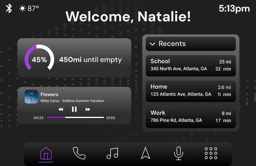
The Home Screen is the main hub for navigation, media, and communication. Drivers can move between tasks quickly without losing focus on the road.
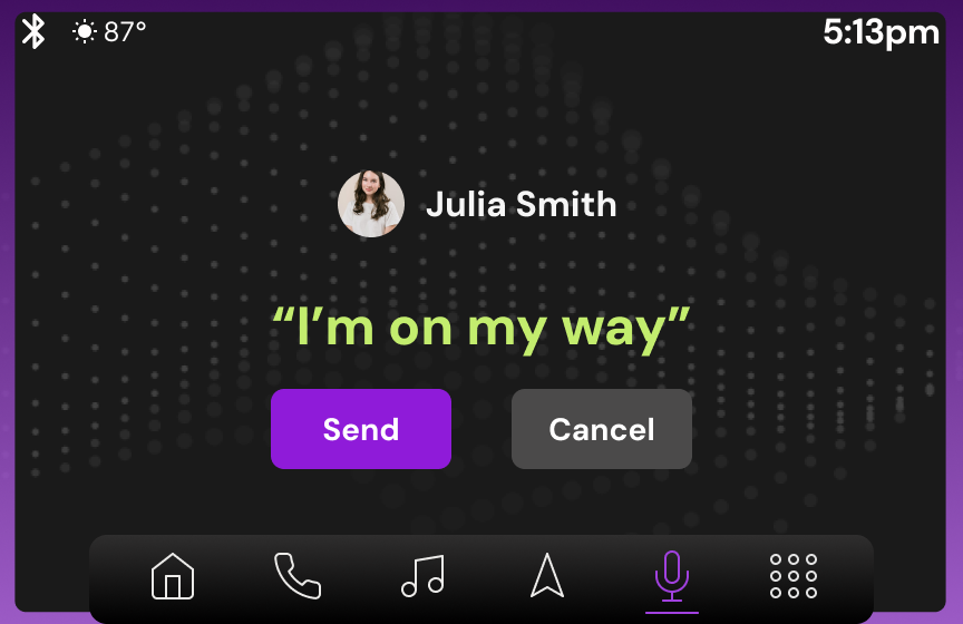
The Music and Messaging screens were designed for quick control through touch or voice. Clear text, simple icons, and smooth motion make the experience calm and distraction-free.
The Voice Interface (VUI) responds naturally to spoken commands and gives clear visual feedback so drivers know when the system is listening or processing a request.
Together, these screens show how Praxis keeps the driving experience safe, simple, and connected.


Challenges & Solutions
One of our main challenges was balancing visual appeal with safety. We wanted the interface to feel modern and engaging without distracting the driver. To solve this, we simplified color use, limited motion, and made key actions easy to recognize with clear visual cues.
Another challenge was designing for voice and touch at the same time. Some drivers preferred speaking, while others relied on the display. We tested both methods and adjusted layouts so that each task could be completed smoothly, no matter how it was controlled.
We also faced trade-offs between adding new features and keeping the interface simple. In the end, we chose to focus on the essentials first, making sure the system worked reliably before adding anything extra.
Reflection / Lessons Learned
Working on Praxis taught us how much design can shape the way people feel behind the wheel. We learned to focus on calm, safety, and trust in every part of the experience. Even small details like spacing, color, or animation can change how confident someone feels while driving.
Throughout the process, we realized that designing for cars means always thinking about movement and attention. What feels simple on a desktop can feel overwhelming in a car, so testing in real situations became one of the most valuable parts of our work.
If we continued the project, we would love to explore more testing in different lighting and weather conditions to see how the interface adapts. Creating Praxis reminded us that the best in-car technology feels effortless and supports the drive without ever getting in the way.