

JobHunt
Role
UX Designer & Researcher
Approach
Lean UX
Duration
September 2024 - December 2024
Tools
Figma, Figjam, Microsoft Teams
Overview:
JobHunt: An easier way to search.
Throughout my journey as a designer, I’ve seen firsthand how job searching can be overwhelming—filled with tedious applications, scattered tracking, and a lack of personalized guidance. Recognizing these challenges, I led a team of three designers through the Lean UX process to create JobHunt, a Figma prototype aimed at simplifying the job search experience.


The Problem:
Job seekers, especially those new to the process, often struggle with application fatigue, disorganization, and uncertainty about their next steps. Keeping track of multiple job applications while finding relevant opportunities can be mentally draining.
The Solution:
JobHunt is a web-based platform designed to help users discover job opportunities, track their applications, and receive personalized career insights. By reducing cognitive overload and offering an intuitive, guided experience, JobHunt empowers users to navigate the job search process with confidence and ease.
Methodology:
Our initial assumptions about users’ pain points were just that—hypotheses. To create a truly user-centered job search platform, we adopted Lean UX, a design approach that prioritizes collaboration, continuous experimentation, and iterative testing.
Unlike traditional UX methods that rely on extensive upfront research, Lean UX encourages teams to make informed assumptions and validate them through real-world testing. To guide our process, we used a Lean UX canvas in FigJam, a collaborative tool that helped us align on project goals, define key assumptions, and structure our hypotheses effectively.
As a team, we worked through each step of the canvas, brainstorming potential market challenges, identifying our target users, and outlining solutions—all while maintaining a focus on user needs and iterative improvement.
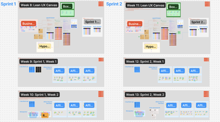
Sprint 1, Design Week 0: Laying the Ground Work
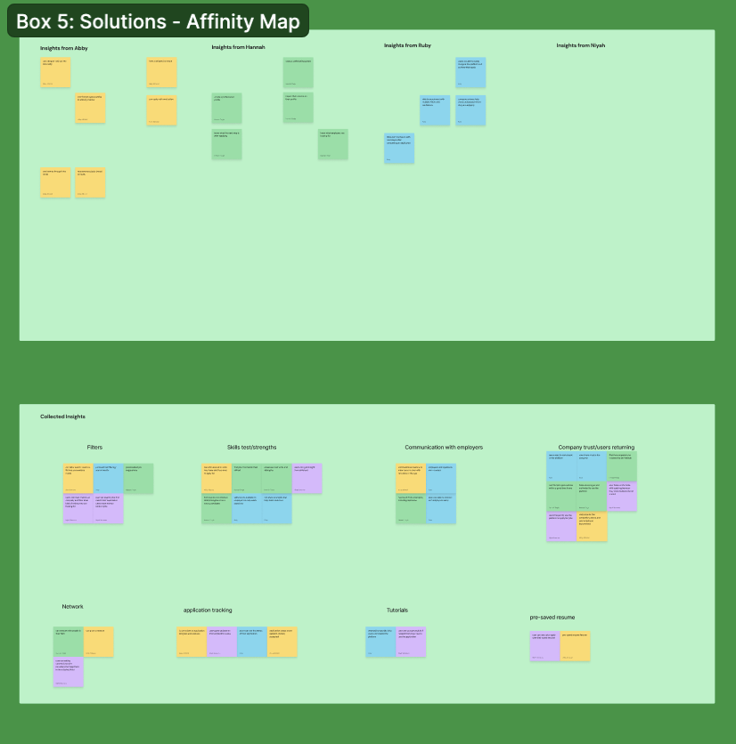
The Lean UX Canvas consists of eight structured steps that guided our team before defining our feature backlog. In the first step, we conducted an affinity mapping exercise to refine our project’s focus. From this, we developed a New Product Problem Statement for our hypothetical stakeholders, outlining our target audience, the gap in the market, our proposed solution, and measurable success indicators.
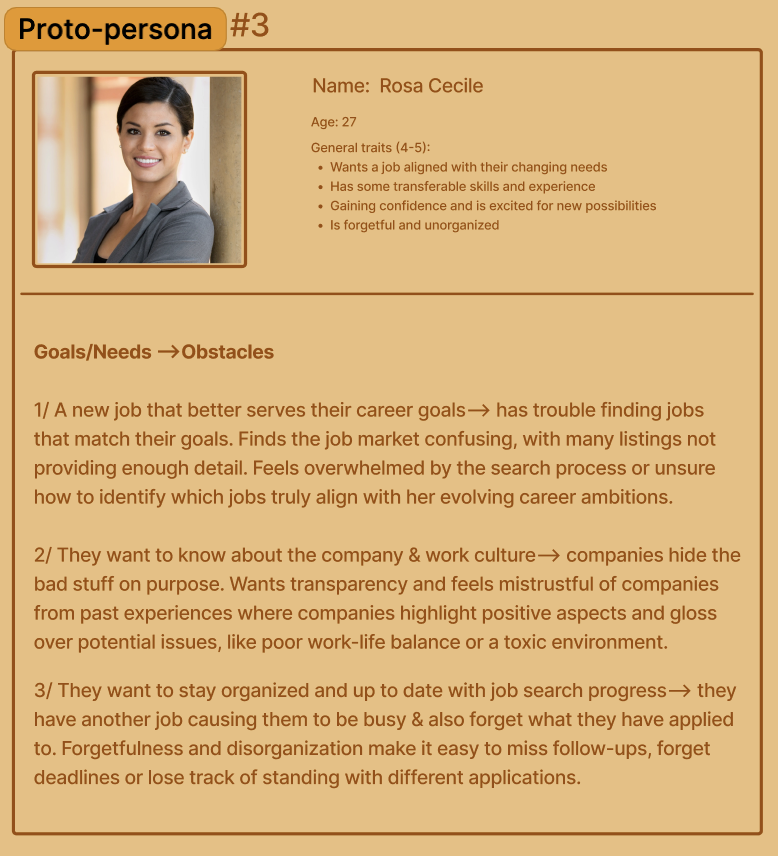
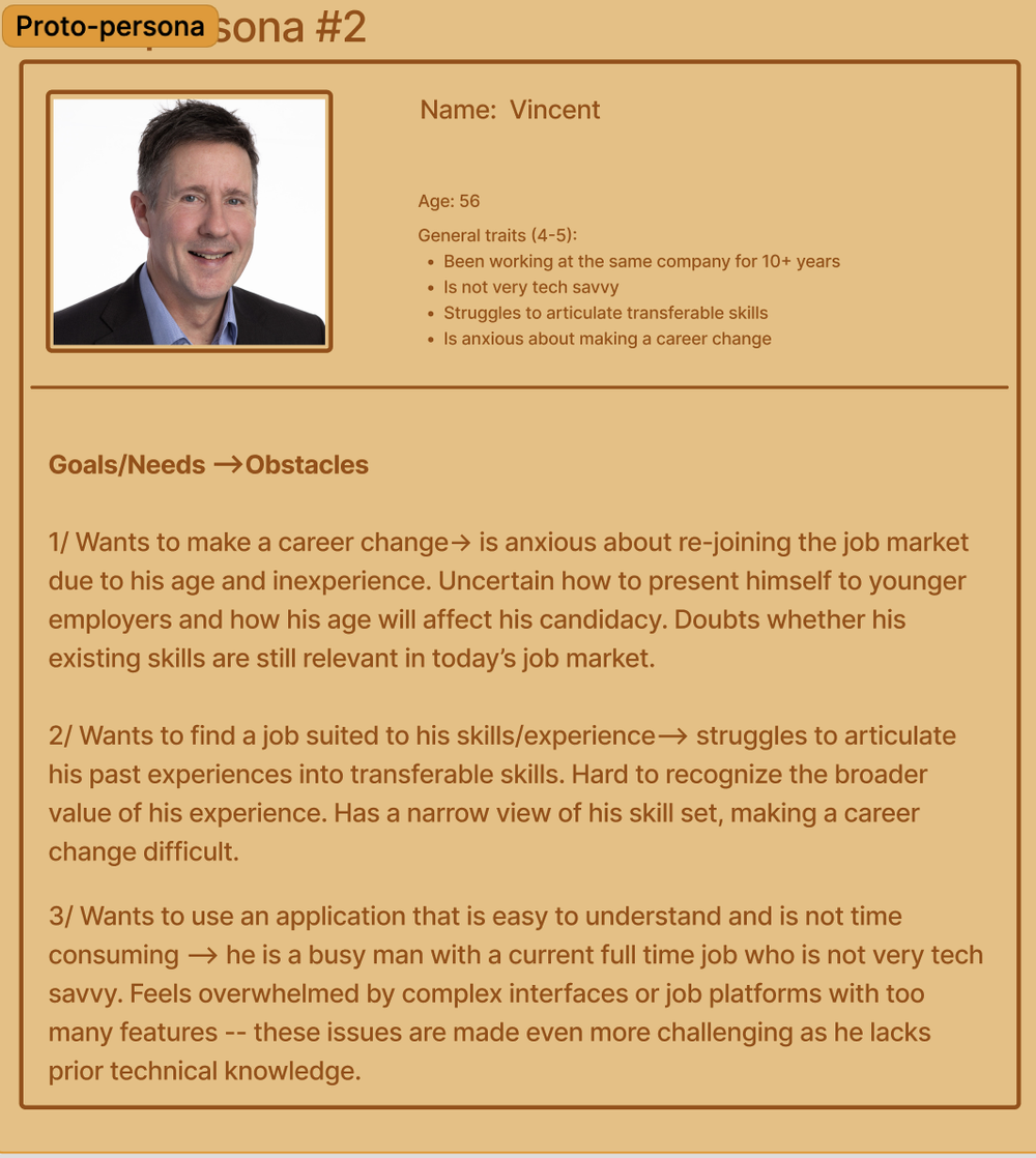
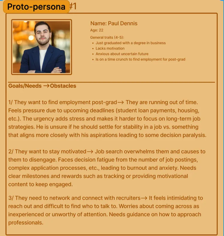
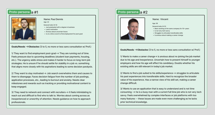
With a clear alignment between user and business goals, we created three personas representing early, mid, and late-career professionals. These fictional yet realistic profiles helped us anticipate user goals, pain points, and behavioral differences, allowing our team to empathize with diverse job seekers.
During step five, we used affinity mapping again to generate and prioritize potential features, identifying recurring ideas from individual contributions. This process helped us focus on the most impactful solutions.
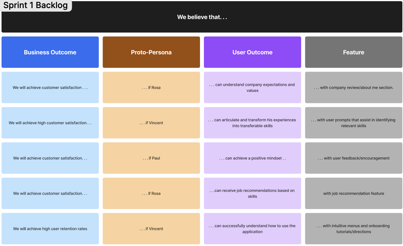
To ensure our features aligned with both user needs and business objectives, we developed a hypothesis table, mapping out key user goals and defining measurable outcomes.
By the end of this eight-step process, our team had a shared understanding of the problems we aimed to solve and the key features to build. Additionally, we established a product backlog for Sprint 1, prioritizing tasks from highest to lowest risk. This approach enabled us to systematically test our hypotheses and iterate effectively.

Sprint 1, Design Week 1-2: Getting Out of the House
Week 1: Kickoff & Stand-Ups
To ensure accountability and maintain momentum, we began with a two-day stand-up, where we discussed weekly goals and assigned tasks. Throughout each design sprint, I scheduled three 15-minute check-ins per week to track progress, address blockers, and align our team’s efforts.
User Interviews & Wireframes
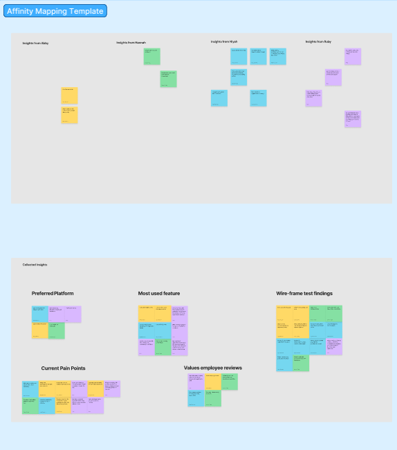
To gain deeper insights into user preferences, we conducted A/B testing during interviews. This method allowed us to make data-driven design decisions rather than relying solely on user feedback from conversations. After each interview, we performed an affinity mapping exercise to identify patterns and key takeaways from our observations.
Sprint 1 Key Findings
Lack of recruiter communication: Applicants often feel discouraged due to minimal responses and unclear next steps.
Enhancing networking features: We identified an opportunity to expand our networking tool, allowing users to connect with and message recruiters within a company.
Stress triggers: The job search and application process—along with the waiting period after applying—were the most stressful stages for users.
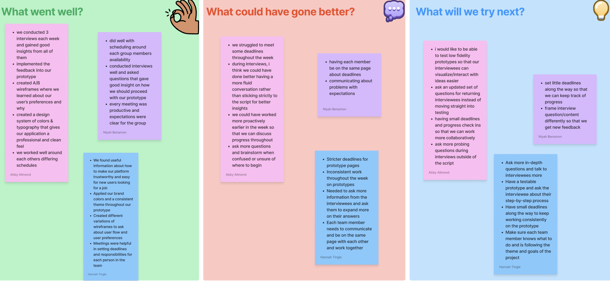
Sprint Retrospective & Iteration
Sprint 2, Week 0 – Persona Refinement
Our initial research revealed overlapping goals among our three personas. To streamline our approach, we removed Persona #3 (Rosa) and redistributed her goals to Personas #1 and #2, ensuring a more distinct and meaningful representation of user needs.
Sprint 2, Weeks 1 & 2 – Refining Our Process
Following our Sprint 1 retrospective, we assessed what worked well and identified areas for improvement. Key takeaways included:
Setting stricter, smaller deadlines for more manageable progress.
Scheduling user interviews earlier in the week to allow more time for iteration and design adjustments.
This iterative process helped us stay agile, refine our features, and better align with user needs.
Sprint 2, Week 0 – Persona Refinement and Re-evaluating Our Assumptions
Our research revealed significant overlap in the goals and challenges across our three personas, making one of them redundant. To streamline our approach, we removed Persona #3 (Rosa) and integrated her key objectives into Personas #1 and #2, ensuring a more concise and meaningful representation of user needs.
Revalidating Our Assumptions
At the start of Sprint 2, we revisited our Lean UX canvas to reassess our initial assumptions. This meeting focused on two key questions:
What did we learn?
What has changed?
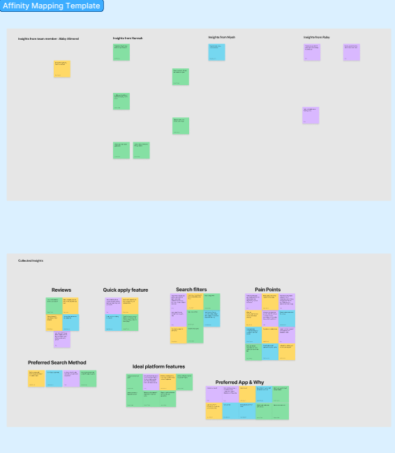
Key Insights from A/B Testing:
Users prefer positive language and playful icons (such as emojis) over traditional rating systems.
Filtering by skills/qualifications and job descriptions is more valuable than filtering by company demographics.
Users dislike the typical autofill from resume feature.
The waiting period after applying causes more stress and anxiety than the job search process itself.
Early-career users feel anxious about networking and uncertain about how to approach it.
Users feel overwhelmed by the sheer number of applications they need to track.
How These Findings Shifted Our Focus
Initially, we assumed that stress and anxiety would primarily occur while using the platform. However, through user interviews, we discovered that these emotions stemmed from external factors—including lack of confidence, limited career connections, and waiting for recruiter responses.
While users found the application process tedious, their biggest frustrations were managing multiple job listings and tracking open applications.
As a result, we shifted away from integrating mental health-related features and instead focused on solving the larger systemic challenges of the job search—helping users navigate uncertainty, stay organized, and take control of their job hunt.
In other words, we aimed to address the root cause of frustration rather than just easing its symptoms.
Sprint 2, Week 1 & 2 – Finalizing Process
Testing Our High-Fidelity Prototype
During this phase, we conducted six additional user interviews, including both returning participants from Sprint 1 and new users. This mix allowed us to compare feedback between those familiar with our prototype and those experiencing it for the first time.
Unlike Sprint 1, where we focused more on behavioral insights, Sprint 2 was dedicated to measuring user feedback. To evaluate the effectiveness of our wireframed features, we incorporated several testing methods, including:
User sentiment scale (1-5, with 5 being very satisfied)
Usability test questions
Card sorting activity
Having measurable MVPs enabled us to gather both quantitative and qualitative data, helping us make informed decisions about which features to prioritize, refine, or eliminate.
As the project neared completion, we focused on refining our design system, implementing a relative 8-pt grid, utilizing auto-layout, and applying consistent color and text styles. Additionally, we organized our files and polished the finer design details to ensure a cohesive and professional final product.
Reflection
Adapting to Lean UX was challenging but rewarding. The fast-paced process was overwhelming at first, but it helped me grow as a designer.
Assumptions don’t always match reality. We had ideas about what users needed, but testing and interviews showed us what actually worked.
User feedback is key. Changing our designs based on real user experiences made our product stronger.
Teamwork and communication matter. Learning my teammates’ strengths helped us divide work better and stay organized.
Small details make a big difference. Paying attention to things like spacing, colors, and layout improved our final design.
Planning is important, but flexibility is too. Schedules change, and research can take the project in a new direction—being open to change helped us adapt.
Iterating can be tough, but it’s worth it. Seeing our work improve with each round of feedback was exciting and made the process fulfilling.